Brand hierarchy

The DTU logo is the heart of our visual identity
It identifies who we are, and must appear on all digital and printed communication produced by the University.
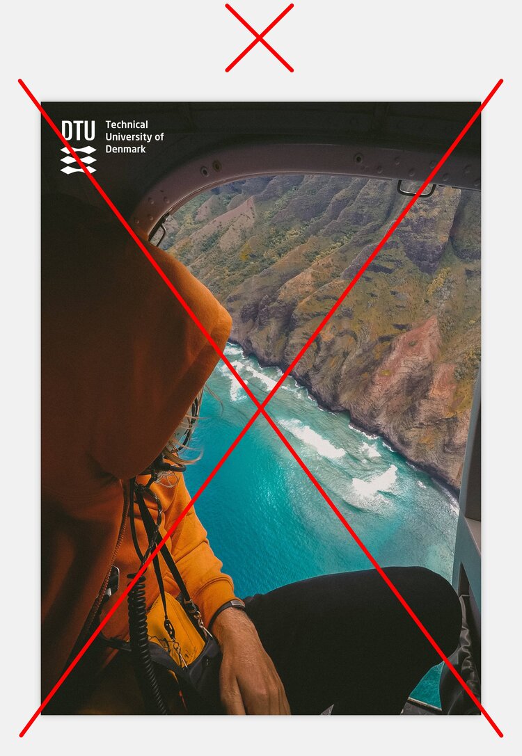
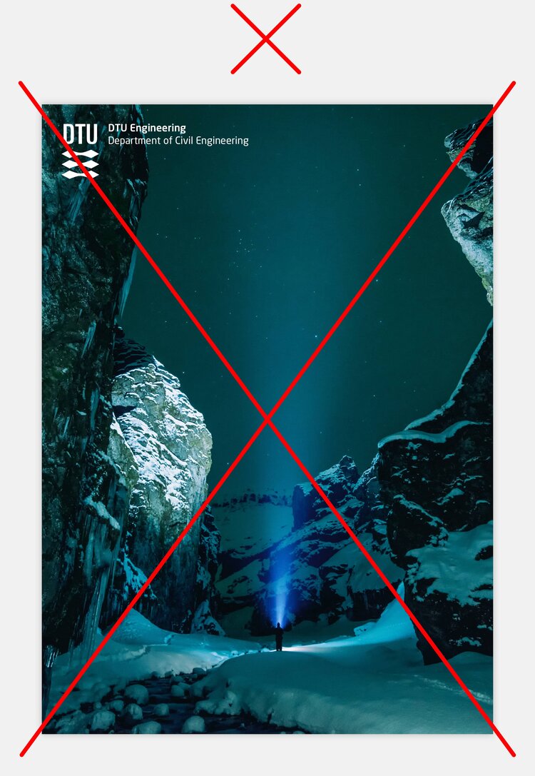
The logo—with the DTU logotype and the three stylized lions—always comes first and is positioned in the upper left hand corner, in printed matter as well as on digital platforms.
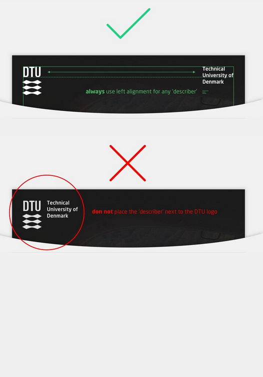
The University wishes to be known by the acronym: DTU. If you need to identify the University further, the DTU logo must visually be clearly separated from the ‘describer’ Technical University of Denmark.
It is imperative that the DTU logo always appears prominently and visibly on all material. This means that you must use the logo in a light colour or in negative dark on multicoloured backgrounds.
DTU logo combined with ‘describer’
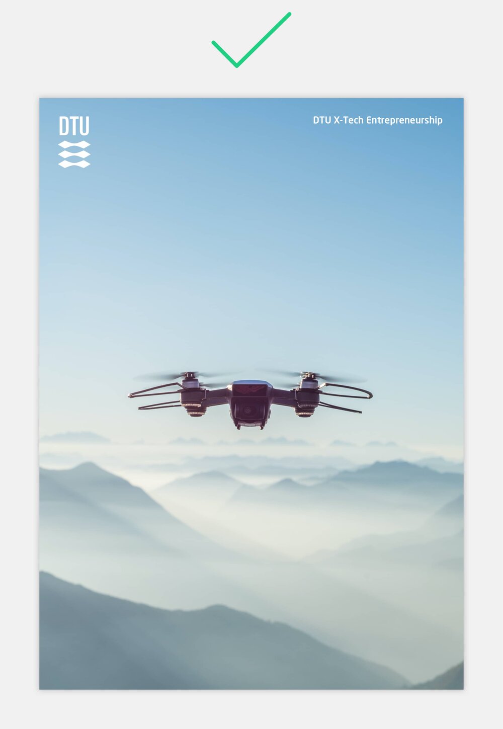
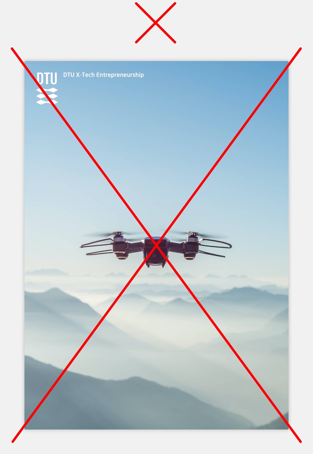
The DTU logo is always positioned in the upper left hand corner.
If you wish to combine the DTU logo with a ‘describer’—such as Technical University of Denmark, your department or centre—you must position this in either the top right hand corner or in the bottom right or left hand corners.
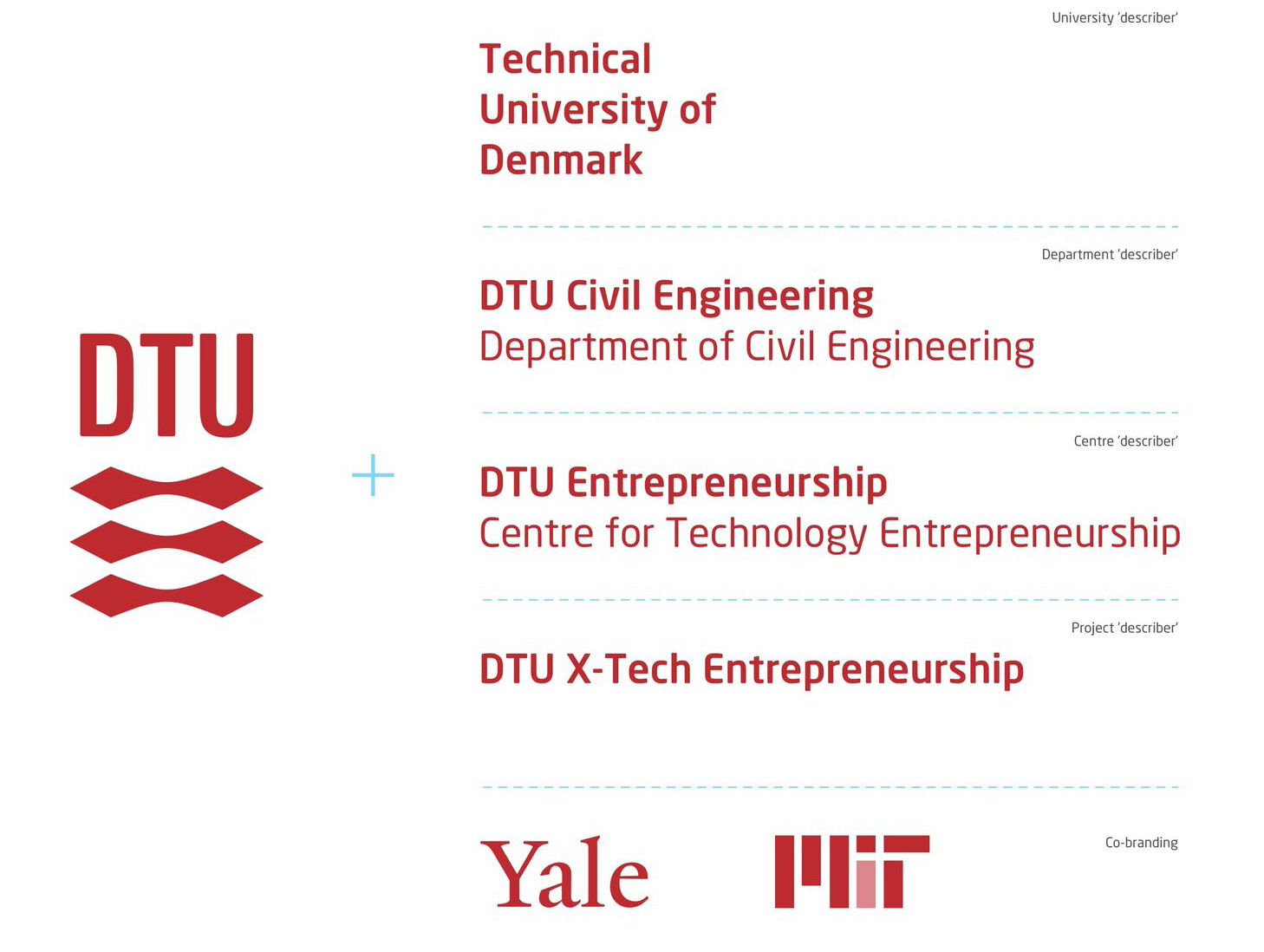
Brand hierarchy alignment and use of typography
These are only guidelines - not rules set in stone

DTU logo combined with University describer
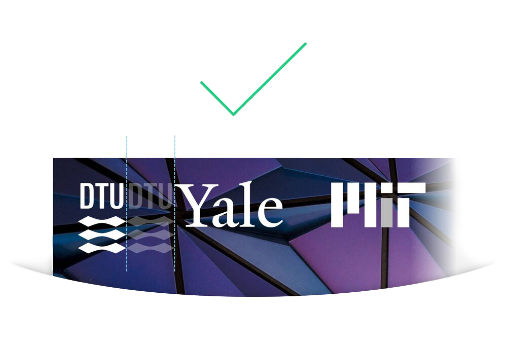
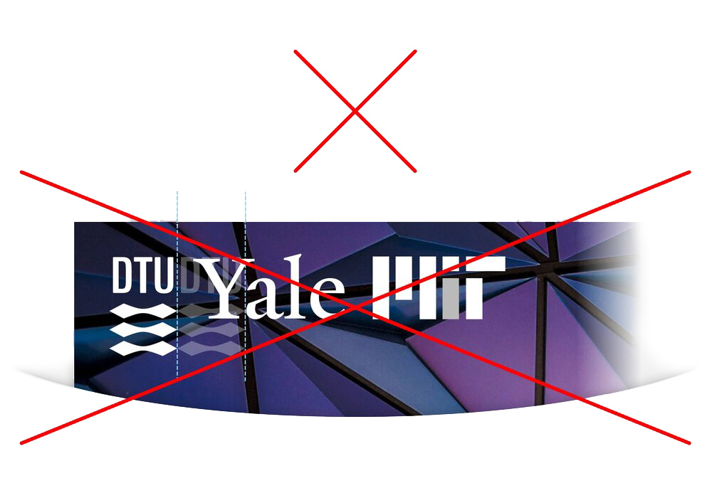
When you use the DTU logo in combination with other logos, you must respect the clear zone around each logo.

DTU logo combined with department 'describer'
When you use the DTU logo in combination with other logos, you must respect the clear zone around each logo.


DTU logo combined with centre 'describer'
When you use the DTU logo in combination with other logos, you must respect the clear zone around each logo.



DTU logo combined with project 'describer'
When you use the DTU logo in combination with other logos, you must respect the clear zone around each logo.
DTU logo combined with partner logos
The DTU logo can also be used in co-branding and appear next to the partner logo. When you use the DTU logo in combination with other logos, you must respect the clear zone around each logo.
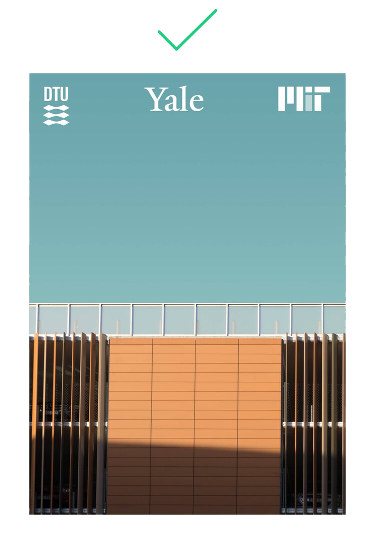
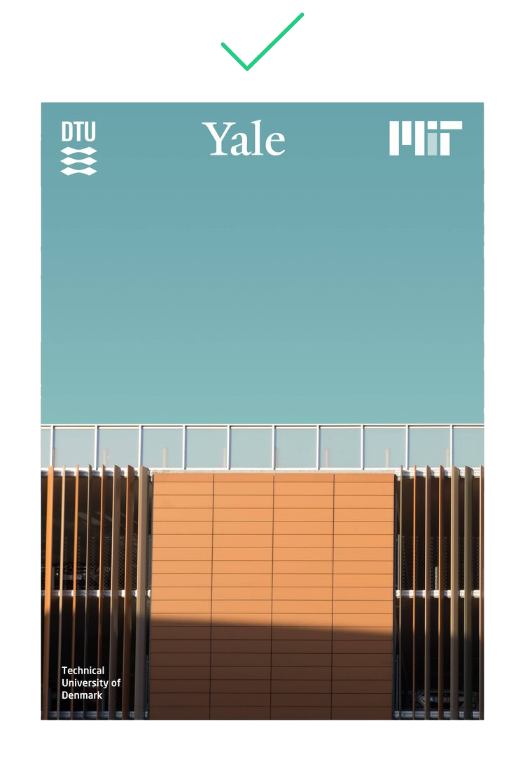
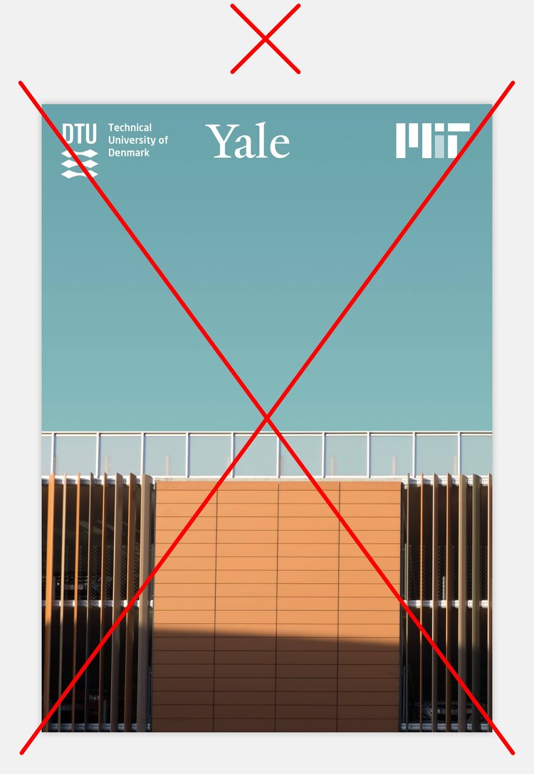



Minimum clear zone for co-branding
