Project mark
A project mark is a simple, approved graphic element that identifies a project within DTU’s design system. It is not a standalone logo or sub-brand.

File formats and colour spaces: the DTU logo exists in different file formats and different colour modes.
Logos in JPG-format can be found under Social Media.
Usage:
To ensure that teh logo is legible and stand out clearly, there are a number of rules you must follow:
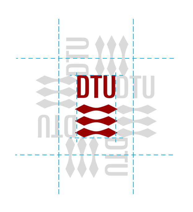
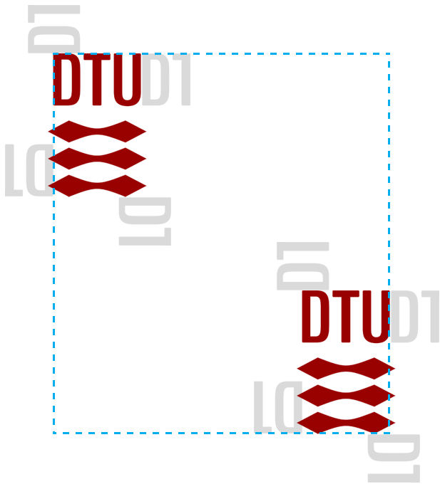
The DTU logo exists in different file formats and different colour modes.
Usage:
DTU logo: colour
There are types of logos: the primary corporate logo and secondary logo
The corporate logo is used in letterheads, on business cards, and in other corporate forms of communication.
The primary logo comes in three variations: in colour (DTU red), in white (negative), and in black.
Use the DTU logo in other colours on posters, PowerPoint presentations, campaigns, etc.
Please note that when you use a secondary logo, we recommend that all other graphic elements are kept in the same colour scheme.

DTU’s visual identity ensures a clear, consistent expression across all communication. At the same time, large research projects and events often have a need for a distinct visual direction that support recognition and collaboration across institutions.
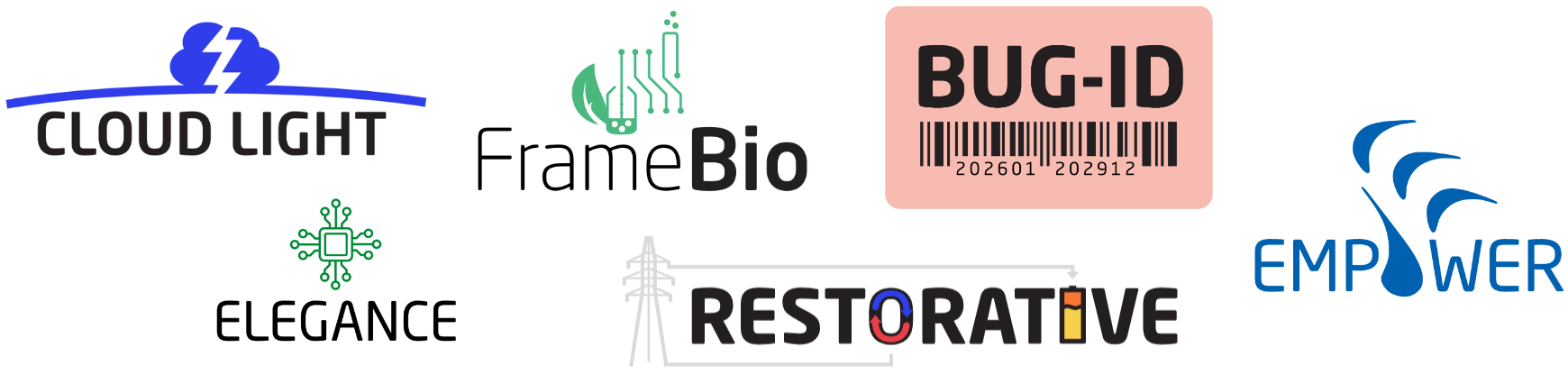
To accommodate this, DTU allows the use of project marks or emblems. These are simplified graphical marks that can be used to identify a specific project within the DTU design framework.
Project marks must never replace the DTU logo. They should always appear together with the DTU logo (or partner logos) and must follow the same grid and spacing principles as described under Logo placement.
Project mark
Project marks can be applied on:
All new project marks must be developed or approved by AKM – Office for Web and Visual Identity. AKM offers guidance, design and produce the graphics or refer to certified external designers.
Project marks - visual examples
Do's
Don'ts