
colours

DTU colours

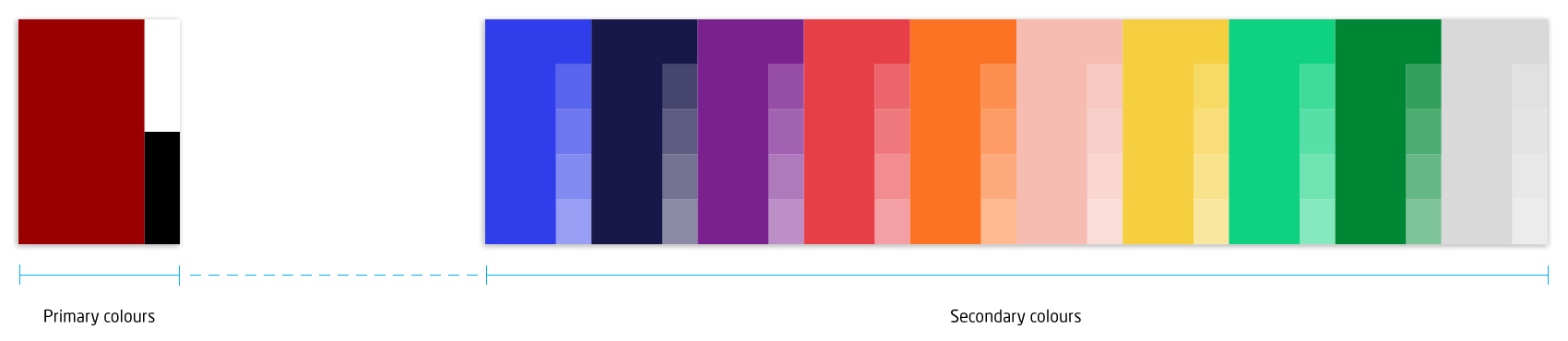
DTU colours are either primary (corporate) or secondary colours.

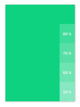
All DTU colours consist of a solid 100% colour and four tints; 80%, 70%, 60% and 50%.

The primary colours are corporate red, white and black. The secondary colours are blue, bright green, navyblue, yellow, orange, pink, grey, red, green and purple.

All colour codes are defined as various colour modes (RGB, CMYK, HEX, Pantone, and RAL).The colours can be used for a wide range of graphic material such as posters, reports and PPT presentations.

Please explore the designguide for inspiration and download templates.

Primary colours

Corporate red

RGB: 153, 0, 0

CMYK: 0, 91, 72, 23

HEX: #990000

Pantone C: 187 C

Pantone U: 187 U

RAL: 3031

White

RGB: 255, 255, 255

HEX: #ffffff

RAL: 9016

Black

RGB: 0, 0, 0

CMYK: 20, 20, 0, 100

HEX: #000000

Pantone C: Neutral Black C

Pantone U: Black U

RAL: 9005

Secondary colours

Blue

RGB: 47, 62, 234

CMYK: 100, 64, 0,0

HEX: #2F3EEA

Pantone C: 2728 C

Pantone U: 2728 U

RAL: 5000

Bright green

RGB: 31, 208, 130

CMYK: 69, 0, 66, 0

HEX: #1FD082

Pantone C: 3385 C

Pantone U: 353 U

RAL: 6038

Navy blue

RGB: 3, 15, 79

CMYK: 100, 94, 44, 40

HEX: #030F4F

Pantone C: 655 C

Pantone U: 282 U

RAL: 5022

Yellow

RGB: 246, 208, 77

CMYK: 0, 19, 84, 0

HEX: #F6D04D

Pantone C: 116 C

Pantone U: 114 U

RAL: 1018

Orange

RGB: 252, 118, 52

CMYK: 0. 65, 86, 0

HEX: #FC7634

Pantone C: 1505 C

Pantone U: 1505 U

RAL: 2003

Pink

RGB: 247, 187, 177

CMYK: 0, 35, 26, 0

HEX: #F7BBB1

Pantone C: 489 C

Pantone U: 489 U

RAL: 3015

Grey

RGB: 218, 218, 218

CMYK: 0, 0, 0, 20

HEX: #DADADA

Pantone C: Cool Gray 1 C

Pantone U: Cool Gray 1 U

RAL: 7047

Red

RGB: 232, 63, 72

CMYK: 0, 86, 65, 0

HEX: #E83F48

Pantone C: 1785 C

Pantone U: 1785 U

RAL: 3017

Green

RGB: 0, 136, 53

CMYK: 89, 5, 100, 17

HEX: #008835

Pantone C: 355 C

Pantone U: 355 U

RAL: 6037

Purple

RGB: 121, 35, 142

CMYK: 67, 96, 0, 0

HEX: #79238E

Pantone C: 2587 C

Pantone U: 2587 U

RAL: 4006

Colour combinations

A clear and flexible colour language

DTU’s use of colour is based on large, solid areas of colour and clear contrasts. Think of the palette as a set of coloured building blocks: a simple and flexible system that can be combined to create many different structures and expressions while remaining recognisably DTU.

As a general rule, we avoid gradients, shadows and transparency. Instead, we use clean, bright colours and distinct contrasts to create visual hierarchy, support legibility and ensure a consistent expression across formats and media.


The colour combination guide provides inspiration for combining DTU’s secondary colours. Each example uses one colour as the main colour and suggests a complementary supporting colour, accent colours and lighter tints. Use the combinations as a starting point, and avoid using all the suggested colours at once.

Explore the colour combination guide (PDF)